.png)
.svg)


This was a concept project created over a fast paced 2 week sprint. The goal was to create a companion app for the Meow Wolf Vortex Music Festival to allow users to plan their event as well as come up with features that would allow users to feel more immersed in the festival. After this project was completed as a group, I returned to it at a later date and re-designed the high fidelity mock ups to better align with the Meow Wolf branding guidelines and to better demonstrate my visual design skills.
- Joseph Caouette
- Christina Knudsen
- Vlada Merkulova
- User interviews
- Affinity Mapping
- Persona creation
- User Flows
- Wireframing
- Prototyping
- Design System Creation
- High Fidelity Mock-Ups

Meow Wolf Vortex music festival attendees need a more immersive way to experience the festival, because last year attendees were disappointed with the lack of immersion that they had come to love from other Meow Wolf exhibits around the US.

The Meow Wolf Vortex companion app allows users to plan their day at the festival by creating a custom schedule of artists they want to see, view a live festival map and find their friends, as well as complete an immersive quest using augmented reality features.
Meow Wolf is an entertainment company that creates extraordinary and immersive art exhibits around the United States. These exhibits are very popular and are visited by thousands of people each year, and are known to hide secrets within them including secret rooms and hidden narratives that can be uncovered through vigorous searching for clues. Below is a brief look at two of their popular exhibits, as well as the most recent Vortex music festival in 2022.
Described as a station where 4 different worlds collide for you to navigate.

A normal looking grocery store that gets weirder the more you look around and explore.

The most recent Meow Wolf Vortex festival hosted in Denver, Colorado in 2022. People loved the music but felt the festival lacked the immersion that they got from other Meow Wolf exhibits.


Our team conducted a total of 7 user interviews with people who either have been to music festivals in the past, or who have experience going to Meow Wolf exhibits. We even got one person who had been to the first Meow Wolf Vortex music festival in 2022 to offer some insight into what that was like.
We affinity mapped the data from those interviews and were able to narrow down a few main points to focus in on for this sprint.


My teammate Christina gathered the competitive and comparative analysis data for us to analyze. She primarily focused on researching other festival apps that features that we want to implement, as well as see if any other apps had features that allowed users to interact with the festival. Below are a few of the main points that we took away from this research.
Meow Wolf had previously developed an app called the anomaly tracker for their exhibit called "The House of Eternal Return." This app allowed users to use augmented reality through their phone's camera to find hidden items and clues throughout the venue. Users really enjoyed using this app, but unfortunately it was discontinued during the COVID pandemic when it became difficult to keep it updated.
We decided it could be a good idea to use this technology that they had already developed in the past and implement it into the app as a way for users to interact with the festival and find hidden items to gain access to a secret room within the venue.


Coachella's festival app from 2022 had a couple features that users really liked that we took inspiration from for our app.
The first is the ability to view the lineup and see what artists are performing, as well as allow users to preview some of the music from that artist if they have not heard of them before.
The second feature is an augmented reality camera that let users find objects hidden throughout the festival and take pictures and videos of those that they can post online to social media. Users loved this feature as it gave them an additional activity to engage in in between viewing artists perform. This further reinforced the idea to include this feature in our app.


Woov is a great inspiration for what a great festival app could be, and it's 5 star rating is proof of that. It's an app that any festival can contract with to use their features, which include a live festival map, custom schedules, and a community tab to connect with others attending the events.
My main takeaway from this app is how great their interactive map is. You can scroll around the 3d map and find your friends or see the locations of everything in the festival. This incorporates both of the features that we wanted to include in our map.

Using the information gathered during the discovery process, we were able to decide on 3 main features that we wanted to include in this design sprint. We were not as concerned with the high fidelity visual design as we were with getting the core placement and functionality of elements. Below are the 3 features that we decided to focus on. I played a role in the design and function of each page, but I will highlight my key contributions to each.
This feature will allow users to see what artists are performing at the event and when, as well as preview music to discover new artists. They can also add those artists to a custom schedule and it will notify them a few minutes before those artists are about to head on stage so they do not miss seeing anybody they wanted to see.
This feature will allow users to see what artists are performing at the event and when, as well as preview their music to discover new artists. They can also add those artists to a custom schedule and it will notify them a few minutes before those artists are about to head on stage so they do not miss seeing anybody they wanted to see.
We designed an augmented reality scavenger hunt that takes user's around the festival to the art exhibits to find hidden objects that can only be seen through their phones camera. Finding these objects will give them clues to solve a puzzle that gains them access to a secret room at the festival or gets them some kind of free gift depending on what the company could justify.

While I did assist in the design decisions of each page, I primarily focused on the design and functionality of the interactive map, organization of the design system, and overall consistency of elements throughout the final design. Below I will go over the design process for each page, and some of the decisions that were made for each page. I will show the initial design of each page all the way up to the high fidelity design, followed by the redesign that I did of that page using the branding guidelines set by Meow Wolf on their media kit.

The home page was a big point of discussion amongst our team. We initially thought that we should use a similar layout to what some of the other music festival apps use, and that initial design can be seen below.
.png)
We did not want to directly copy the ideas of the other festival apps, so we also came up with a few other ideas on how this page could be laid out.


The problem that we saw with this design is that it only functions as a navigation tool for the app, and does not offer any functionality of its own. We knew that we wanted to have a bottom navigation bar because that is what people are familiar with from the most popular apps on the market, and once we added the bottom navigation there would be no use for this home page.
We wanted the home page to have a utility of its own, and decided it would benefit to the user to be able to open the app and quickly see the most important information that can be found on other pages without having to navigate.
The information we wanted the home page to display:
1. The next artist set to perform on the user's schedule
2. The artists currently performing on each stage at the festival
3. The ability to quickly locate close by friends at the festival
4. The art exhibits available at the festival
.png)
We also made another version of the home page that would be available for users before the date of the festival. This version gives users features related to browsing what will be available at the festival, as well as share their custom schedules with their friends.
.png)
My job was not to work on the interface design for the high fidelity versions of this page, but I did go through after the design was finished to ensure that the design was consistent. I also had the task of prototyping the entire application. Below you can see the final design created by my team, as well as my version of the design that I completed at a later date using Meow Wolf's media kit guidelines, and copying the same style that they use in their advertising.
My Team's Design
.png)
My Re-Design


Our team originally wanted to use a format similar to google calendars for the lineup page, but we quickly realized that this made the page look much too crowded. In the case that there are 3 or more stages for artists to perform on, the page would be toocluttered for the user's eyes as shown below.
.png)
My solution to this problem was to create a list format for the lineup page, and instead use the calendar format for the custom schedule that users would create for themselves. Below you can see how much more organized the lineup looks using this list format.
.png)
For the custom schedule, our final design did not vary too much from the original version. We had to adjust the spacing to allow for easier viewing, as well as add a line that goes across the schedule during the festival to show the user where in the timeline their schedule is at. Below is the first iteration of the custom schedule page.

Below you can see the final high fidelity version of the lineup and schedule pages made by my team.


When I did the my redesign of the app, I tried to make these screens easier to read, navigate between, and faster to load without unnecessary resources. My high-fidelity versions of the lineup and schedule page can be seen below.
.png)
.png)

I had full creative control over the interactive map, but in this first sprint I did not have time to make the high fidelity version as high quality as I would have liked. In the first sprint with my team, I really just wanted to focus on the overall layout and functionality of the interactive map.
My first design was a very simple view of the map that allowed users to view the locations within the festival grounds, and below that see what the icons for each location stood for using a legend.

With this first design, I realized that the map may need to be a little bit too small in order to fit on the same screen with the legend. In my second iteration, I opted to make the map larger and make it more of a 3D design, and hide the legend unless users press a button to pull it up. This would make it easier to see the map, and if users needed to check what an icon stood for they could press the button on the bottom left to pull up the map legend.

What i did not consider with these first two designs, is that there would also need to be a footer at the bottom of the map to allow the user to navigate between other pages of the app. This bottom navigation would clash with the legend button that I had in the bottom left of my second iteration. I had also not added an option to let users search for their friends within the festival, which was a major feature that users wanted to see added into the app in the user interviews. In the third iteration, I opted to simplify the map design and get the placement of elements correct to incorporate all of the necessary features.

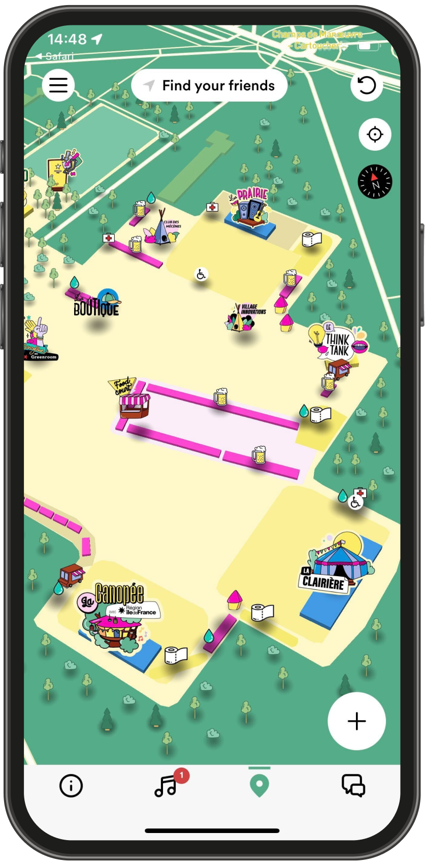
To map the map easier to read in my high fidelity version, I flipped the layout to be horizontal and used the same colors that MeowWolf used on their festival map for 2022. In the final prototype I also included what it would look like when the map asked for permission to use location services. Below are the final versions from the first sprint.


In my high fidelity re-design sprint, I recreated the 3D map that Meow Wolf used for their 2023 festival and made it interactive and higher quality. With this version of the map, users can tap on icons to to reveal what the icon stands for, removing the need for a map legend. Users can also zoom in and out, scroll around the map, and find their friends.


There was a lot of back and forth amongst our team about where this feature should be located within the app, how it should be laid out, and what exactly it should involve. We needed to make sure that it was not so complicated that developers would have issues creating it, but also make it unique so that Meow Wolf fans would take interest in it. Meow Wolf had previously developed an augmented reality app to go along with one of their exhibits, and their fans had great things to say about it. We wanted to use that same technology that they had already created and incorporate it into this app.
In the first iteration, the idea was to have a large list of tasks that the user could complete, and by doing so they would gain access to a secret exhibit hidden within the festival. During the process of completing these tasks, they would uncover a story that they could follow along with as well. Meow Wolf is known for having secret narratives and areas hidden within their venues. On a separate clues tab, users could keep track of the story points that they uncovered so far.

.png)
In the second iteration, my teammate decided to add several pages that let the users read the background story behind the quest when they start it. Then, she broke the tasks up into 3 sections for the 3 different exhibit locations at the festival where the tasks would need to be completed. She also decided to change the "clues" tab to read "achievements" instead to give people more of a sense of accomplishment as they complete it.


I brought up the point that not everyone may want to read the background story behind the quest page, and that we should add an option to skip reading the story and just let people complete their tasks as fast as possible. My teammate worked up her final iterations of the immersive quest pages, and some of those pages can be seen below.


Below are my high fidelity iterations of the quest page. I chose to simplify this page to lessen the visual stimulus for the user and keep the design similar to the lineup and scheduling pages.


Due to the short time frame on the project, an official design system was not created. However, all of the components, colors and typography were well organized by myself to ensure a speedy setup for the official design system when it came time for it. As the project went through it's iterations, I would keep track of the iterations we made on different screens and the rationale behind certain changes that we would make so that we could look back and understand why we made those changes. Below is a a look at the organization of some of the components of my high fidelity redesign for the app. as well as some of the more complex components that involve animations and multi-screen navigation within single pages.


This was a large project with a lot of ground to cover, and our team accomplished a great deal within the short two week time frame that we had to complete it. Our main goal was to get the functionality of the app down, and I think we did do a great job of making sure that the user would have no issue using and navigating the primary functions on the app. Where we struggled was quickly coming up with high fidelity designs in a two day period. This left us little time to iterate on the designs, and we went with one of the first iterations for that we came up with for the sake of time. It was for this reason that I decided to do a separate sprint on my own to ensure that the high fidelity designs followed the branding guidelines laid out by Meow Wolf on their website.
1. Leave enough time to create higher quality and more thought out high fidelity designs.
2. Voice any concerns about aspects of the design early so that there is time for them to be addressed, or make a note of the concerns for future sprints to address them.
3. Designs do not have to be very complicated, less is more. The more complicated the design, the higher the cost of development in money and time.


