.svg)

This was a solo project where I found a local small business called Wire Outlet, that specializes in cellphone repairs and accessories, and re-designed their e-commerce website to better the user interface, information architecture, and overall user experience.
- Joseph Caouette
- User Interviews
- Competitive/Comparative Analysis
- Task Flows/User Flows
- Sitemapping
- Sketching/Wireframing
- Prototyping
- High Fidelity Mock-Ups
- Responsive Design

Wire Outlet's current website has problems with it's functionality, layout of elements, and information architecture. This has been causing issues for customers who want to use their online services, and it is potentially losing their business with Wire Outlet. Device repairs are a large part of this business's income, and their customers need a way to set an appointment for that online so they are not forced to call in to the store.

My re-design of Wire Outlet's website enables the customer to not only locate and purchase the cellphone products that they need, but also enables them to set appointments to have their devices repaired.
1. There are issues with the layout of the site, which causes some menus to overlap and some selections are unable to be pressed.
2. Many pages on the site are not functional.
3. There is no way to set appointments to get your phone repaired on the site
4. When you go to the site homepage there is a large and poorly made banner ad that makes the site feel untrustworthy. It offers that you could potentially win a Tesla by spinning a wheel and entering your email.
5. The site is split up into so many specific categories that it may make finding what you need even more difficult.

1. What websites do people like to use to purchase their cellphone accessories?
2. What kinds of problems/pain points do people encounter when using their favorite websites?
3. What kind of process do people use/What steps do people take when deciding on a product?

.png)


I created two personas that could exemplify two potential customers of a website like Wire Outlet. Based on the information gathered in the user interviews, they each have different problems and goals that they are looking to address, and as a result they each have a different user flow through the website.

Brandon is an animator for Pixar who loves to express his creativity. When he shops for a new phone case, he is often frustrated with the bad navigation or lack of options on many major sites. He needs a better way to purchase a phone case that gives him more options and a simple way to see those options.

Katie has broken her phone screen again. She has broken it so many times, and always has to go to multiple places to get her phone fixed and to get a new phone case. With her busy schedule, she needs to find one place that she can get her phone fixed and pick up a more protective case for next time.

In my competitive analysis, I wanted to compare Wire Outlet to some of the websites that users mentioned in the interview process, as well as find a couple of other websites that specialize in selling cellphone products. Below I will show some of the points that I discovered with each site that I compared to.

In one of the user interviews I did, the participant used Target's website to try and find a phone case that they would be interested in. However, when they searched for the type of phone that they have, the website displayed results for many other types of phones as well as the one that they have. This made it difficult for the user to find a phone case that she could use. She mentioned that she was annoyed that she now had to do another search or add more filters to find what she needed.

I wouldn't be able to do an accurate competitive analysis without looking at Amazon. This website dominates the market for phone accessories because of the abundance of options and cheap pricing that it offers. Several of the user interview participants chose Amazon as their primary option for finding a new phone case. While Amazon is great for the amount of options that it offers, not all of those options are good quality. Buyers may unknowingly choose a phone case from a private seller that is of poor quality, or their order gets shipped incorrectly causing major pain points for the buyer. Additionally, the large number of items offered on the site can make it confusing for some users to navigate around to find what they need.

I found a website called cellular outfitter that offers a wide variety of cellphone accessories for almost all types of phones. It encourages users to select the type of phone that they have first in order to be shown only options for that device. Users can also use a navigation bar on the left side of the page to filter through options and find what they need that way as well. However, this left navigation bar has an odd layout and is not formatted correctly which can cause problems for users. The other issue with this site is that almost every time you open a new page the site will give you a pop-up window offering a different coupon. Coupons are great, but in the user interviews conducted not a single candidate liked when pop-ups break their flow of navigating through the site.

Casetify is recognized as one of the top sellers for phone cases, and they frequently collaborate with online influencers and celebrities to create unique designs for their products. The website design is clean and concise, with a minimal style that does not cause the user to have to scan the page much to find what they are looking for. Their phone cases are also known for being high quality and users have come to expect that they will get their money's worth when shopping here. One strange design choice on their site is that the main way for people to filter through phone cases is by the artist who designed them. This could make the process of finding a case that they like a little more difficult, but overall it is not a large problem and the overall site design is very good.
1. Make sure the search function gives users what they are expecting to find. Such as, if they search for their particular kind of phone, they are only shown accessory results for that phone so they do not need to do another search.
2. Casetify allows users to change the type of phone that they have on the case product page, so if they accidentally ended up on a product page for the wrong kind of phone, they can change the phone type without having to navigate away from the page.
3. Casetify's site layout was superior due to its simple design that made it easy to navigate.
4. Create a simple way to show filter options for product display pages to make browsing easier.
5. We need to be able to filter product reviews to see the good and the bad.

I created a separate user flow for each persona in order to be able to show how two different users may navigate the website and move through the checkout process. This would enable me to have a more focused idea of what I need to design for this first sprint.
Persona 1 comes to the website with the intention of finding a phone case for their Google Pixel, and they have a good idea of what they are looking for already. He needs to be able to quickly find the page that displays phone cases for his type of device, find the one that he likes, make sure the reviews are decent, and have a smooth checkout process.

The second persona has a very different flow through the site. Her phone screen has broken and she needs to set an appointment to get that repaired. In addition, she needs to get herself a new phone case that she feels will prevent her phone screen from breaking again in the future, and be able to pick this new phone case up in the store when she completes her phone repair.


My next step in the process was creating the wireframes for both task flows. I made these wireframes over the span of two days and also made it a functioning prototype so I could test the flow through the website as a user would experience it.
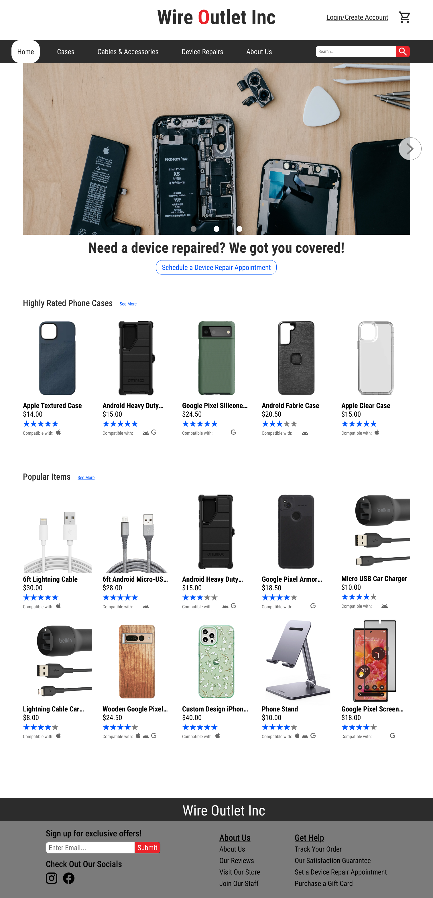
I designed this home page with a layout like Casetify's in mind. A simple and clean design seemed like the best way to go as it allows the user to easily find what they need without the need to scan the page too much. I opted to display a carousel in the top fold of the page that allows for quick access to several important pages on the site. I wanted the option for viewers to set a phone repair appointment to be front and center, since that is where a majority of the business's revenue comes from.

This is one example of the product list page that could come in several different forms, such as the "highly rated products" page, "newly added products" page, or just a general list of products for a particular type of phone. The filter list on the left was a rough idea of how I wanted the filters to look, but I refined the filter layout and type of filters in the high fidelity design. I wanted to show users what type of phone the products displayed were compatible with so that they could make a choice of product easier and would not have to click on the product to see if their phone would be compatible. In addition, I also put the items overall rating underneath the price of it for the users that are review conscious.

I took inspiration for the display page from several different sites. The overall layout is similar to that of Target, but I also added the ability to change the type of phone that the product is for as long as it is compatible with other devices. The reviews section was very important in the user interviews, as almost every user checked the reviews on an item before making a purchase. I created a component that allows the reviews to be sorted by most recent, highest rated, and lowest rated, so that no matter what the customer is looking for in a review, they can find it.

Here is a look at the various screens that walk through the checkout process for the first User Flow. One big change made here was adding a progress bar to the top of the checkout process to make users aware of where they are in the process of checking out.


In the first draft of the high fidelity designs, I kept the typography and colors very simple and wanted to make sure I had the layout how I wanted it. Below you can see the first and second version of several different pages. I also created mobile versions of these designs which can be found in the next section.
In the second version, I wanted to create a fitting logo for the company, as well as create a more inviting feel with the typography used in the company name. I also got rid of the clunky looking top navigation bar and chose to instead have a floating navigation bar to give the site a much cleaner look. I also changed up the typography for the headings, added a little more spacing between some elements, and changed the design of the primary action buttons to make them stand out more on the carousel.

The HIERR team was very satisfied with the deliverables that our team gave them, and plans on using everything created for their project. We had also included space on the user's guide document to allow for other languages to be added in due to the diversity on the islands. The project is set to launch in July of 2023, but is expected to be delayed due to unforeseen development issues.
1. Sometimes designs are not always what is needed for a project. In this case, it was more beneficial for us to create the HIERR team an entire template website because this saved them time and money.
2. Ask questions. We had several initial meetings with the HIERR team to really understand their rationale behind what they were asking for, as well as to get a clear understanding of what their vision was for the project.
3. If you have extra time, fill it coming up with new ideas about how else you can provide help or offer other solutions.
.png)
